Responsive Relaunch of My Martial Arts Website
Relaunch of My Martial Arts Website
After 62 days of work, I relaunched today my martial arts website kogakure.de in a brand new, mobile-optimized design and with a complete rewritten codebase. And I have still some time left until the end of April when Google will start to punish websites, which are not mobile-optimized.

The previous version of my website was driven by Django and you can still have a look at the code on GitHub, but I don’t use Django anymore. Instead, I use Ruby on Rails and Ruby a lot at work and at home, which is why it was the best solution to use Jekyll to create my website, as I did with this website before.
And as with this website, I could reuse a lot of my automation and ideas, on how to structure the project. I use Gulp.js to watch for changes, run a development server with BrowserSync, and generate all my files.
And in the same manner, I minimize, combine, squash, revision and optimize everything, including the Critical Render Path.
History
To give some context, kogakure.de is my oldest website, I started it in 1999. Back then the design was dark, ugly, and with awful typography. Originally it was intended to collect all knowledge I found about Ninja and Ninjutsu, but it became quickly quite popular.
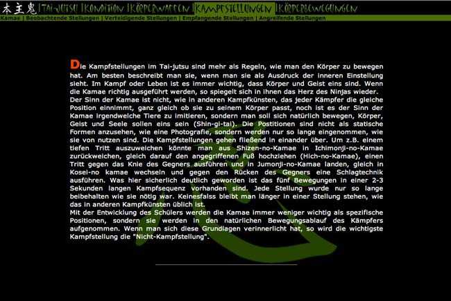
In January 2002 I created the 2nd version of my website with some PHP, a table-based layout with tiny fonts, a fancy JavaScript navigation, and Flash.
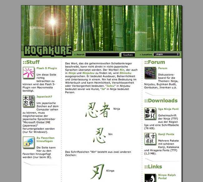
In September 2004 I launched a new design, for the first time with bamboo as a design element and a white design. My website was mentioned in a popular science print magazine (P.M. Magazine), which increased the visits about 8 times the regular visits.

In April 2006 I launched the 4th edition of kogakure.de, running on ExpressionEngine. I created a new version of my bamboo design in Adobe Illustrator. The same year my website became even more popular when German television broadcasters asked me to support them with information for their documentaries (Welt der Wunder, Galileo). After the broadcast of these documentaries, my visitor numbers exploded.

In April 2008 I relaunched the 5th edition of my website with Django and refreshed the design a little bit.

Design
Layout
After I finished the relaunch of this website in April 2014 I started working on the new design of kogakure.de in early summer 2014. I stopped creating full-featured designs in Photoshop some years ago, but still, use it to create mood boards and quickly try iterations of different ideas. Very early on I was sure I wanted to keep the bamboo and my Rakkan and decided to keep my style and don’t create something completely different.
Typography
I always start with Typography and selected a modular scale and a typeface very early on. I found a typeface on Google Fonts (Exo), which matched perfectly my style and the topic of kogakure.de and was good to read.
Vector Graphics
More and more displays have a high pixel density now, which is the reason I decided to use as many vector graphics as possible. I recently read and heard a lot about SVG and decided to use SVG as my vector technique on kogakure.de. SVG is more capable and future-proof compared to vector fonts.
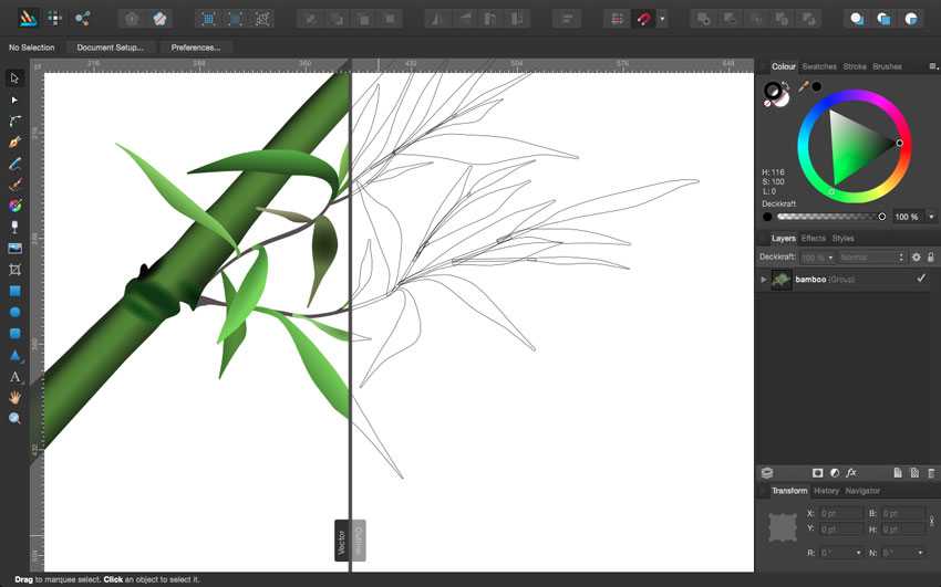
My bamboo and logo were created in Adobe Illustrator and I thought it would make sense to use them as SVG. Unfortunately, I had used the mesh tool of Illustrator to create my bamboo design, which is not compatible with SVG. So I had to recreate the whole design with supported gradients (linear, elliptical, and radial).
I hate Adobes cloud solution and pricing and had decided some month ago not to spend a shit load of money every month on a design tool, but instead bought Affinity Designer. I recreated the bamboo with Affinity Designer and it was really fun, so much faster, intuitive, and easier, as with Adobe Illustrator. And the bamboo looks even better now!
Technology
Static site generator
I had decided on Jekyll very early on because I had used it on this website and it was a lot of fun and very comfortable to create a website with Jekyll.
Automation
As with this website I used Gulp.js again to automate everything from development to production. I wrote a series on Gulp.js if you would like to know more.
Search
One problem, which is common on a static site, is that it’s hard to have dynamic content. Most of my website is quite static, why Jekyll is a good fit. But creating a search without dynamically created pages and a database is not an easy task.
Fortunately, with lunr.js it’s possible to have a full-text search on your static website, running with JavaScript. I used the fantastic Jekyll Lunr.js search of Ben Smith, which creates a JSON file of my content, filtering out stop words. And it’s working well!
Grid and Responsive Design
There are two kinds of grids systems: Classical CSS Frameworks and Grids-on-Demand.
I’m a big fan of Grids-on-Demand and think CSS-Frameworks is a waste of time, money, and fun. The latter one creates a lot of CSS with class attributes, to use all over your markup and pollute everything with class attributes (e. g. .col-1-of-6 or .push-3-of-12). With a Responsive Design, this gets even messier and is quite inflexible. You mostly have to decide on major breakpoints and add class attributes to all of your containers for all your breakpoints. Examples of these kind of frameworks are Bootstrap, Foundation, Pure.CSS, Unsemantic and others.
Grid-on-Demand Systems are far more flexible. They need a preprocessor to run and provide Mixins for your grid. You only create grid code, when needed and don’t have to ship all possible variations of grids with your CSS. Examples of these systems are Susy and Singularity.
I used for kogakure.de Singularity, which I used before for this website. I like it in particular because it’s the most flexible system I’ve ever used. You can create every Grid imaginable with it.

On my website, I use four different grids: One with 3 columns, one with 6, with 14 and 16 columns. Because it’s silly to use 16 columns on a small screen or 3 on a desktop screen. With Singularity, it’s possible to create grids, which change depending on a Media Query.
BEM
On this website, I used BEM for the first time as CSS architecture. I started like I do all my projects, but during development came across common CSS problems with specificity and had to overwrite a lot of CSS.
I stopped and decided to use BEM, nevertheless, I was never a fan of how class attributes are written in BEM and refactored all my CSS. And even after this short time, I have already seen a lot of advantages. Everything is totally clear, easy to find a class attribute in the CSS. And that’s only with me as a developer and with my CSS. It is surely so much more valuable with large teams.
Conclusion
I finished my Responsive Design just in time, with Google starting to use mobile-friendly as a ranking factor, and equipped my website to work on all kinds of different devices and displays.
Responsive Web Design is now state-of-the-art and the best way to provide a website to an unknown number of screens, devices, and resolutions. Nobody knows the future, but we will see new devices, ranging from smartwatches up to 4K displays. And native apps simply can’t be the answer for a majority of websites on the web.
Creating the website was a lot of work, but also a lot of fun. And I hope it will be more fun for my visitors with mobile devices (currently 40% on phones and 9% on tablets) to read my articles and enjoy the site.